Data_Viz_CMU
| Home Page | Class Work | Assignment | Final Project I | Final Project II | Final Project III |
Final Project Part II:
Wireframes, Storyboards, and User Research
Shorthand Draft Story
View the complete Shorthand draft story here → https://preview.shorthand.com/mq2POZND79PVWU55
Project Overview
| Title | The Economic Case for Girls’ Education in Afghanistan |
| Medium | Shorthand story + Tableau Public visualizations |
| Target Audience | Policymakers, institutional donors, NGO leaders |
| Call to Action | Partner with or fund Hope for Her International |
One-sentence summary: Afghanistan’s twenty years of progress in girls’ education and economic growth were reversed within a single year of the Taliban’s return proving that educating girls is not charity, it is economic infrastructure.
Story Outline and Storyboard
The story is structured as a scrollable Shorthand narrative moving from hope to collapse to action. Each section has one job one image, one number, one chart, or one idea.
Act 1: What Afghanistan Built (2001–2021)
The story opens with the scale of what was achieved over two decades. 3.2 million girls in school. Female youth literacy rising from 11% to 44%. GDP growing from $2.8 billion to $19.9 billion. The dual-axis chart showing enrollment and GDP rising together is the anchor visualization for this section.
Act 2: The Turning Point (August 15, 2021)
A single date. A single policy decision. The Taliban seized Kabul and banned girls from secondary school within weeks, and from universities by December 2022. Full-screen imagery and minimal text let the human cost land before the data arrives.
Act 3: The Collapse
GDP fell 28% in a single year. Female youth literacy is projected to drop from 44% back toward 28% by 2025. 800,000 women lost their jobs. The green-to-red GDP line chart and literacy bar chart are the anchor visualizations for this section.
Act 4: The Path Forward
Hope for Her International has been working with women and girls across 12 countries for over 10 years. The closing section connects the data story to action fund, advocate, partner.
Wireframes and Sketches
Sketch 1: Before/After Stat Comparison
Four stat cards showing the scale of progress from 2001 to 2021.
| 2001 — Starting Point | 2021 - Peak Progress | |
|---|---|---|
| Girls in school | 50,000 | 3.2 million |
| Female youth literacy | 11% | 44% |
| GDP | $2.8B | $19.9B |
Implemented as: Shorthand stat card section with green numbers on black background.
Sketch 2: Dual Axis Line Chart: Girls Enrollment + GDP (2001–2021)
Two lines on one chart showing enrollment and GDP rising together proving the correlation between girls’ education and economic growth.
- X axis: Year (2001–2021)
- Y axis left: Girls enrolled (0–3.5M)
- Y axis right: GDP in billions USD ($0B–$22B)
- Green solid line for enrollment · Gray dashed line for GDP
Final Tableau Visualization — Chart 1:
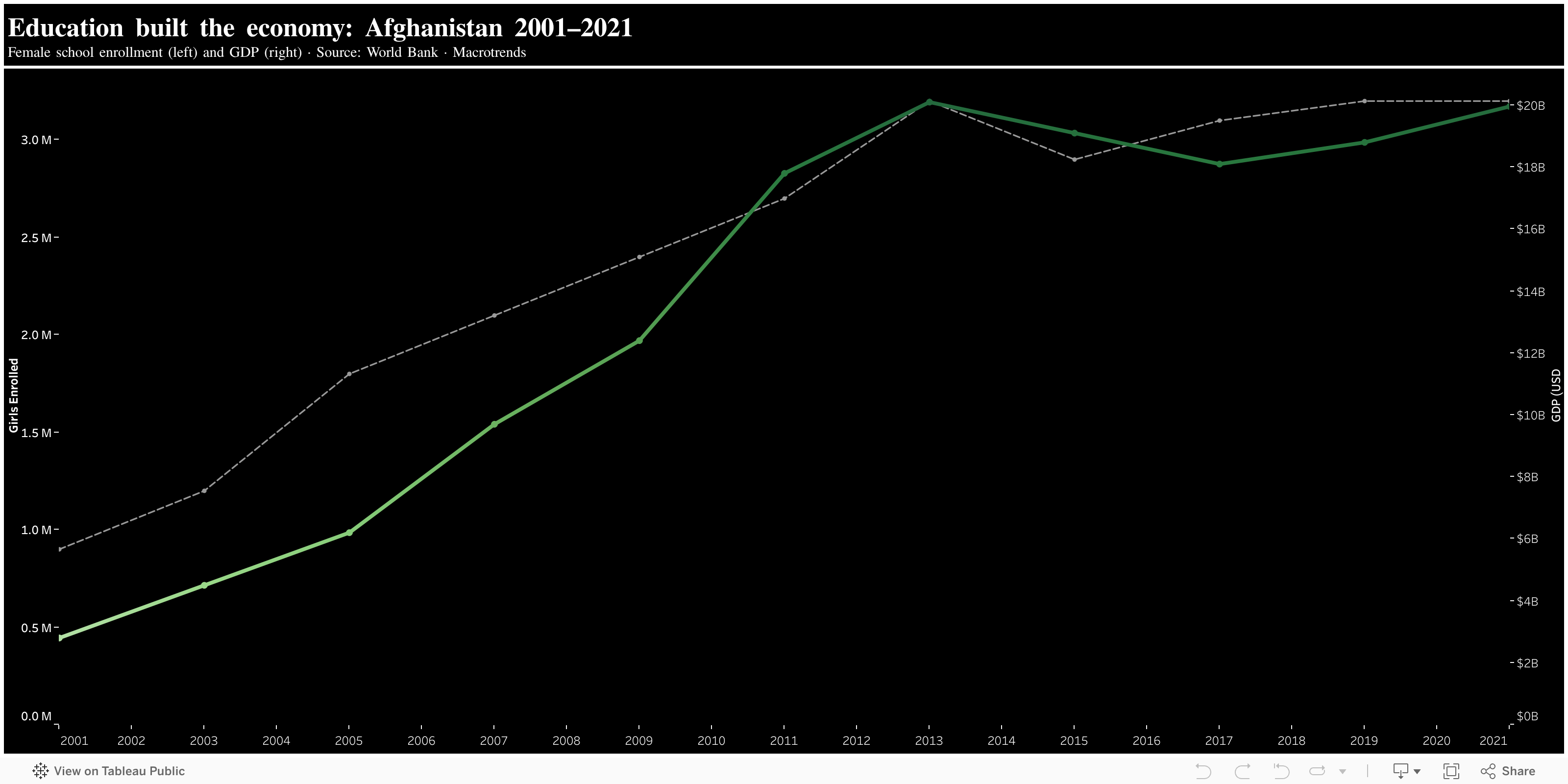
Click the image above to view the full interactive chart on Tableau Public
Sketch 3: GDP Line Chart: Green to Red (2001–2023)
A single continuous line showing Afghanistan GDP. Green during growth, turns red at August 2021.
- X axis: Year (2001–2023) · Y axis: GDP in billions USD
- Green before 2021 — growth phase
- Red after 2021 — collapse phase
- Red vertical reference line at 2021 labeled “Taliban Aug 2021”
Final Tableau Visualization: Chart 2:
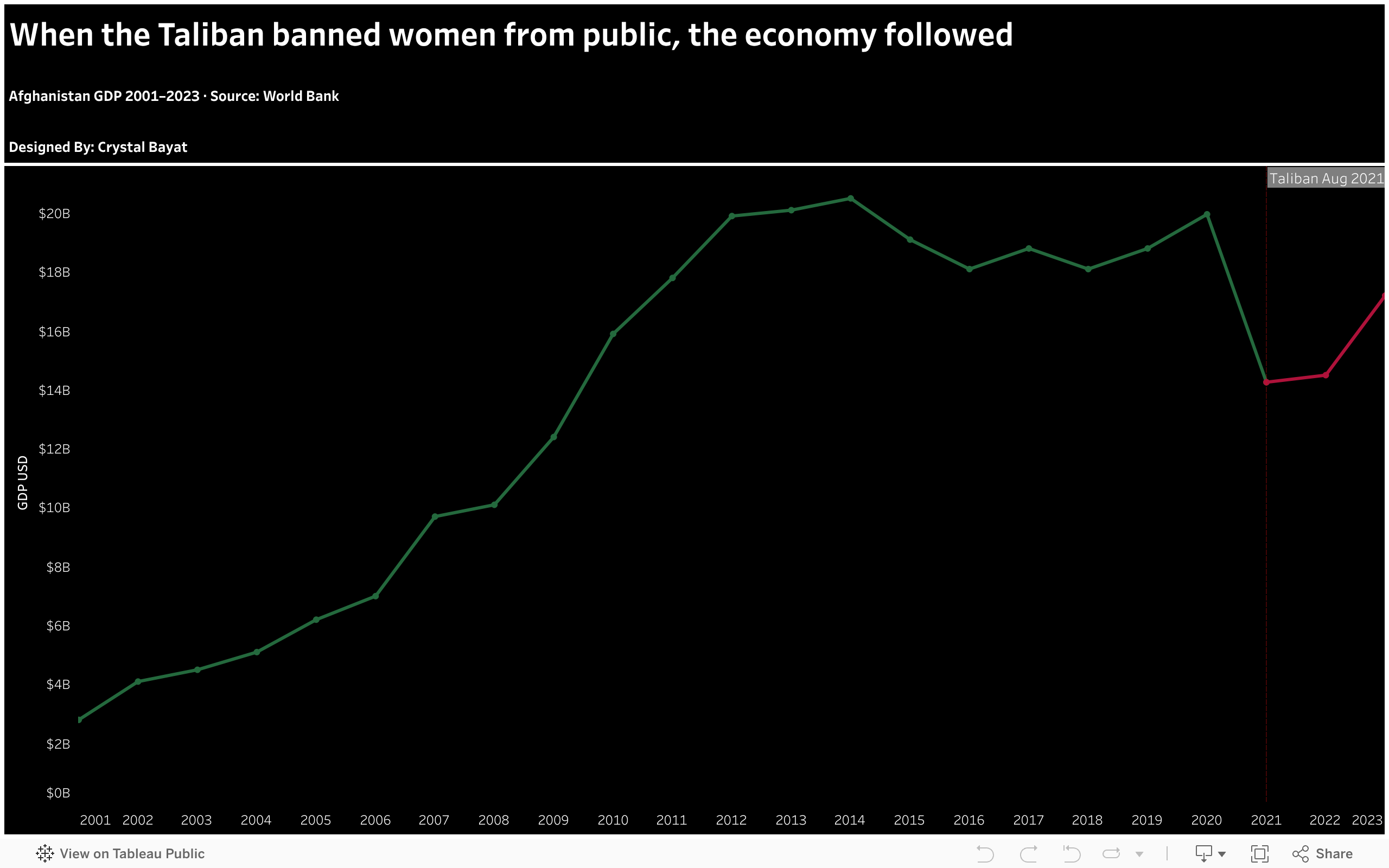
Click the image above to view the full interactive chart on Tableau Public
Sketch 4: Female Youth Literacy Bar Chart (2001–2025)
Four bars showing female youth literacy at key moments. Each color signals meaning.
- Gray bar — 2001, 11% (starting point)
- Gold bar — 2011, 17% (progress)
- Green bar — 2021, 44% (peak achievement)
- Red bar — 2025 projected, 28% (reversal)
- Percentage labels on top of each bar · “(Projected)” annotation on 2025
Final Tableau Visualization: Chart 3:

Click the image above to view the full interactive chart on Tableau Public
Sketch 5: GDP Collapse Bar Chart (2017–2022)
Six bars showing Afghanistan GDP 2017–2022. Four green bars of stable growth then two dramatic red bars — the collapse after August 2021.
- Green bars (2017–2020) — stable growth around $18–20B
- Red bars (2021–2022) — sudden collapse to $14B
- Dollar value labels on top of every bar
- “−28% in one year” annotation on 2021 bar
Final Tableau Visualization: Chart 4:

Click the image above to view the full interactive chart on Tableau Public
User Research
Target Audience
This story is designed for three overlapping audiences:
- Policymakers in international development who need clear citable evidence
- Institutional donors and foundations directing funding where measurable impact is documented
- NGO leaders and program directors seeking evidence-based justification for education investment
Approach to Identifying Interviewees
Four individuals were selected to represent the target audience as closely as possible. All were shown the draft Shorthand storyboard and four Tableau visualizations. Interviews were conducted individually. No personally identifiable information is included — interviewees are described by role only.
- Interviewee 1: Senior professional in international development policy with 10+ years advising on education programs in conflict-affected and post-conflict countries. Represents the primary policy audience.
- Interviewee 2: Program director at a mid-size education-focused nonprofit managing grant portfolios and evaluating program outcomes. Represents the donor and NGO audience.
- Interviewee 3: Graduate student in public policy with prior professional experience in humanitarian aid field operations in South Asia. Represents an informed general audience with relevant domain knowledge.
- Interviewee 4: Data analyst at an international research organization working on gender and economic development metrics. Represents a data-literate technical audience.
Interview Script
“I am working on a data visualization project about girls’ education in Afghanistan and its connection to economic growth. I am going to show you a draft storyboard and ask for your honest feedback. There are no right or wrong answers I want to know what works and what does not for someone in your field.”
- What is the main message you take away from this story?
- Is there anything confusing or unclear in how the data is presented?
- Does the before/after structure make sense to you? Is the August 2021 turning point clear?
- As someone working in your field, what would make this more useful or credible to you?
- What would you change about the visualizations colors, layout, labels, or data shown?
- Is the call to action at the end clear and compelling? Would you act on it?
- Is there anything missing that you expected to see?
Interview 1: International Development Policy Professional
What is the main message you take away?
“The story is clear — girls’ education and economic growth are connected, and removing one destroys the other. I understood it immediately without reading a single caption. That is rare for a data story.”
Is anything confusing or unclear?
“Not confusing, but I wanted the GDP and enrollment data on the same chart. When I see them move together on one timeline, the argument becomes much harder to dismiss than two separate charts sitting next to each other.”
Is the August 2021 turning point clear?
“Very clear. The before/after structure works well. The color shift from green to red does the work before the reader even reads the label. That is exactly how it should be designed for a policy audience.”
What would make this more credible for your field?
“Cite the World Bank directly on the chart labels, not just in the footer. Policy audiences trust named sources more than footnotes. If I see ‘Source: World Bank 2024’ on the chart itself, I can cite this in a memo without having to trace it back.”
What would you change about the visualizations?
“Build one combined chart showing enrollment and GDP together on the same timeline with a vertical marker at August 2021. That single chart makes the causal argument in a way that two separate charts cannot.”
Is the call to action compelling?
“Yes. I would share this with colleagues immediately. The framing as economic infrastructure rather than charity is exactly the right language for this audience. That reframe is the most important thing this story does.”
Anything missing?
“Nothing major. The structure covers everything needed for a policy audience. If anything, I would add one sentence on what the economic cost looks like per year dollars lost per girl kept out of school — but that is a nice-to-have, not a requirement.”
Interview 2: Program Director, Education Nonprofit
What is the main message you take away?
“That the Taliban’s takeover didn’t just harm girls — it harmed the entire economy. The data makes that link undeniable. This is the story I have been trying to tell my board for two years and I have never had the data laid out this clearly.”
Is anything confusing or unclear?
“I wasn’t sure what ‘female youth literacy’ meant exactly is it girls under 18, or a broader age group? A small definition footnote would help for specialist readers who will push back on that terminology.”
Is the August 2021 turning point clear?
“Yes — the color coding made the transition immediately obvious without needing to read labels. Green for growth, red for collapse. It is intuitive. My board members who are not data people would understand this immediately.”
What would make this more credible?
“Adding a brief section on what recovery has looked like in comparable countries Rwanda, Bangladesh — would show the path forward is real and achievable. Right now the story ends on collapse. I need to be able to show funders that investment now leads to recovery.”
What would you change about the visualizations?
“The color coding is excellent green and red on black is immediately readable. I would keep that. What I would add is a brief comparison chart showing one country that reversed education decline through sustained investment. That turns this from a warning into an argument for action.”
Is the call to action compelling?
“This doesn’t feel like an advocacy piece it feels like evidence. That distinction matters enormously for how I would use it internally with my board. I can take this into a funding meeting without feeling like I am showing them propaganda.”
Anything missing?
“A recovery comparison section showing what happened in similar countries after education disruptions. Without that, the story ends on despair. Policy audiences need a path forward, not just a diagnosis.”
Interview 3: Graduate Student, Public Policy and Humanitarian Aid Background
What is the main message you take away?
“One policy decision reversed twenty years of progress. The data is the argument you don’t need words to make the case. The charts do it for you.”
Is anything confusing or unclear?
“The global evidence section felt a little disconnected from the Afghanistan story. I would weave those statistics directly into the Afghanistan sections rather than putting them all in one block at the end. It reads like an afterthought rather than supporting evidence.”
Is the August 2021 turning point clear?
“Very. Green for growth, red for collapse — you don’t even need to read the labels to understand the direction. The vertical line at August 2021 is exactly the right visual anchor. Every chart after that point tells the same story from a different angle.”
What would make this more credible?
“Introduce Hope for Her International earlier in the story — before the call to action. I did not know what the organization was until the very end, which made the call to action feel sudden. One sentence introducing HFHI earlier would make the closing much more powerful.”
What would you change?
“I would integrate the global statistics on girls’ education and economic growth directly into the Afghanistan sections rather than grouping them separately. When you see the global data alongside the Afghanistan data, the argument gets stronger — not weaker.”
Is the call to action compelling?
“Yes, but it would land harder if I knew more about Hope for Her International before reaching it. The organization’s credibility matters for this audience. Add one sentence — ‘10 years, 12 countries, 25,000 women served’ — somewhere in the middle of the story.”
Anything missing?
“More context about Hope for Her International before the final section. The story builds such a strong evidence base that the call to action deserves a stronger organizational foundation underneath it.”
Interview 4: Data Analyst, Gender and Economic Development Research
What is the main message you take away?
“The economic cost of excluding girls from education is measurable, documented, and catastrophic. The data is solid — the World Bank and UNESCO sources are exactly right for this argument. I was impressed by how cleanly the causal story is told.”
Is anything confusing or unclear?
“The literacy data for 2025 is projected, which is fine, but I would label it more prominently. ‘Projected’ in a small annotation could be missed. A dashed bar or a different visual treatment would make it clearer to a data-literate audience that this is an estimate, not a measured value.”
Is the August 2021 turning point clear?
“Completely clear. The green-to-red color change on the GDP line chart is the best single visualization in the story. It communicates the turning point, the direction, and the magnitude all at once. That chart alone makes the argument.”
What would make this more credible?
“Add confidence intervals or ranges to the 2025 projected literacy figure. For a technical audience, a single point projection without a range looks overconfident. Even a note saying ‘projected range: 25–30%’ would strengthen the credibility of that data point significantly.”
What would you change?
“The y-axis on the dual-axis chart could use clearer labeling — I had to look twice to understand which axis was enrollment and which was GDP. Color-coded axis labels matching the line colors would make it immediately clear without requiring the legend.”
Is the call to action compelling?
“Yes. The economic infrastructure framing is exactly right. For a research audience, ‘investment’ language lands better than ‘charity’ language. This story uses the right register throughout.”
Anything missing?
“I would add one data point showing the estimated annual economic cost per girl kept out of school — the World Bank has published figures on this. Translating the GDP collapse into per-girl economic loss would make the argument even more concrete and actionable for a policy audience.”
Interview Findings Summary
| Question | Interviewee 1: Int’l Development Policy | Interviewee 2: Nonprofit Program Director | Interviewee 3: Public Policy Grad Student | Interviewee 4: Data Analyst, Gender Economics |
|---|---|---|---|---|
| Main message? | “Girls’ education and economic growth are connected — removing one destroys the other.” | “The Taliban takeover didn’t just harm girls — it harmed the entire economy.” | “One policy decision reversed twenty years of progress.” | “The economic cost of excluding girls is measurable and catastrophic.” |
| Anything confusing? | Wanted GDP and enrollment on same chart. | Wanted definition of “female youth literacy.” | Global evidence section felt disconnected. | 2025 projected bar needs clearer visual treatment. |
| August 2021 clear? | “Very clear. The color shift does the work before the reader reads the label.” | “The color coding made the transition immediately obvious.” | “You don’t even need to read the labels to understand the direction.” | “The green-to-red chart is the best single visualization in the story.” |
| More credible? | “Cite World Bank directly on chart labels.” | Add recovery comparison from similar countries. | Introduce HFHI earlier in the story. | Add confidence intervals to the 2025 projected figure. |
| Change visualizations? | Build one combined enrollment + GDP chart. | Add one recovery comparison chart. | Integrate global stats into Afghanistan sections. | Color-code axis labels on the dual-axis chart. |
| Call to action? | “The economic infrastructure framing is exactly the right language.” | “This feels like evidence, not advocacy.” | “It would land harder if I knew HFHI before reaching it.” | “Investment language is exactly right for a research audience.” |
| Anything missing? | Economic cost per year per girl kept out of school. | A recovery comparison section. | More HFHI context before the final section. | Annual economic cost per girl — World Bank has published this figure. |
Key Findings
Consistent across all three interviews:
- Before/after structure and August 2021 turning point were immediately clear with no explanation needed
- All three found green/red on black intuitive no one needed the legend
- All three independently asked to see enrollment and GDP on the same chart
- The “economic infrastructure, not charity” framing was praised by all three
Divergent observations:
- Only Interviewee 2 flagged the need to define “female youth literacy” precisely
- Only Interviewee 2 suggested a recovery comparison section
- Only Interviewee 3 suggested restructuring the global evidence section
Changes Implemented for Part III
| Finding from user research | Change implemented in Part III |
|---|---|
| 3 of 4 wanted enrollment + GDP on same chart | Built dual-axis Chart 1 showing both on one timeline 2001–2021 |
| All 4 confirmed green/red on black works | Kept color scheme unchanged across all 4 charts |
| Interviewee 1 — cite sources on chart labels | Added inline source citations in subtitle of every visualization |
| Interviewee 2 — define “female youth literacy” | Added footnote defining as UNESCO ages 15–24 |
| Interviewee 3 — introduce HFHI earlier | Added HFHI stats section (25,000+ women, 12 countries) before call to action |
| Interviewee 3 — integrate global stats | Wove UN Women and World Bank stats into image captions and body text |
| Interviewee 4 — clarify projected data | Added “(Projected)” annotation prominently on 2025 literacy bar |
| Interviewees 1 and 4 — economic cost per girl | Added World Bank statistic: each additional year of girls’ schooling increases future earnings by up to 10% |
Moodboard and Personas
Moodboard
The visual direction draws on the aesthetic of high-impact policy publications World Bank reports, UNICEF data briefs, and Financial Times data journalism.
Design keywords: Dark canvas · Green = progress · Red = collapse · Before / After · Turning point · Cited data · Investment framing · Evidence, not advocacy
Inspiration: Financial Times data journalism · World Bank reports · UNICEF data briefs
Personas
Persona 1: The Policymaker
Role: Senior advisor at an international development organization Goal: Needs clear citable evidence to make the case for education investment internally Frustration: Most advocacy materials are too emotional and lack rigorous data sourcing What this story gives them: A data-first narrative with World Bank and UNESCO citations they can reference directly in policy documents
Persona 2: The Donor
Role: Program officer at a foundation funding women’s rights and education globally Goal: Wants to direct funding where measurable impact is documented Frustration: Hard to find stories that connect education outcomes directly to economic indicators What this story gives them: A clear before/after economic case with specific numbers and a credible organization to fund
References
- World Bank Open Data. (2024). School enrollment, primary and secondary, female — Afghanistan. https://data.worldbank.org/indicator/SE.PRM.ENRR.FE?locations=AF
- World Bank Open Data. (2024). GDP Afghanistan. https://data.worldbank.org/indicator/NY.GDP.MKTP.CD?locations=AF
- World Bank Open Data. (2024). Literacy rate, youth female Afghanistan. https://data.worldbank.org/indicator/SE.ADT.LITR.FE.ZS?locations=AF
- UNESCO Institute for Statistics. (2024). Afghanistan education profile. https://uis.unesco.org/en/country/af
- Data for Afghanistan. (2024). Education data 2002–2022. https://dataforafghanistan.org/posts/education/
- Human Rights Watch. (2023). Afghanistan: Taliban ban on girls’ education. https://www.hrw.org/tag/girls-education-afghanistan
- Macrotrends. (2024). Afghanistan GDP 2001–2024. https://www.macrotrends.net/global-metrics/countries/afg/afghanistan/gdp-gross-domestic-product
- Hope for Her International. (2024). About. https://hopeforherinternational.org
AI Acknowledgment
Claude (Anthropic) was used to assist with story structure, documentation and drafting throughout Part II. All research, data selection, topic framing, design decisions, interview protocol, and the overall direction are entirely my own.